In short
- The question
- I wanted to explore what generative AI means for imagery, as the next step after my photography, and to show that work the way it was meant to be seen.
- Approach
- I make the series, give each one its own concept and art direction, and built a platform of my own for them with agentic coding.
- Delivered
- A public site where every series has its own form, with images that arrive fast and sharp, on a foundation that can grow with it.
From photographer to image maker
I have photographed people since 2009: weddings, families and fashion shoots too. In 2023 I started making images with generative AI, and it did not feel like a break but like the next step. I use the same language as behind the camera: light, lens, fabric, pose, the place where someone stands. Only now there is nobody in front of the lens.
Flesh & Fiction is where that work comes together, in series meant to be looked at slowly. One sentence carries the project: It is not about realism versus artificiality. It is about how easily one becomes the other.
There is no finished business plan yet. What there is: finished work on a public site, a way of working I can repeat for every new series, and a technical foundation that can grow into a full product.
What it can offer a client
The series on the site are free work, but the same approach fits someone else’s campaign or project: a fashion label launching a collection, a cultural venue with a festival, a brand with an archive full of photographs. Anyone who looks through the portfolio and has something in mind can bring me in for the visual side:
- A series around an idea, held together by a concept, the way each series below has one.
- Its own art direction: palette, typefaces, layout and rhythm, tuned to that one series and not taken from a template.
- Images that belong together: the same person, the same place and the same light across a whole series.
- Existing work brought back to life: an archive of real photographs extended with new images, with an honest seam between them, as in Noir Elegance.
- A presentation on the web that shows the series the way it was meant, fast and sharp on every screen, as its own microsite if need be.
That offer is still taking shape, and it grows with what the technology can do: moving images, and sound.
What follows comes in two parts you can read separately. The series shows each series with its concept and a video. How it is made covers the platform, how the images come about and how I build.
The series
Every series starts from an idea of its own, and gets an art direction that complements the images. Rather know straight away how it is made? Jump to that part.
Noir Elegance: the seam stays visible
Noir Elegance starts with real photographs: a fashion shoot I photographed in 2015, in black and white against a rough industrial ground. In 2023 that shoot became the starting point for new images made with generative AI. The question of the series: which of them belong together?
That link is measured, not assumed, and the result is more honest than expected: the image model borrowed a mood, not a composition. Where a pair holds up, photograph and image stand side by side, with the seam literally in view. The other frames stand alone, with a single line beneath them: photographed or generated. Four ways lead through the series, from one frame per screen to the whole body of work at once, as on a light table. See Noir Elegance on fleshfiction.studio (opens in a new window).
Zahara: images that were dealt
Eighteen images of fabric in the air: chiffon, organza and tulle, in rooms built of cloth and coloured light. The prompts are not descriptions but a word list from the vocabulary of fashion photography, shuffled blind for every image. Nobody wrote these pictures. They were dealt, like cards.
Those words build the pages too: in eighteen covers every image becomes a magazine cover with its own words as coverlines, and in the gust the scroll becomes a single horizontal lane of fabric. Because the series exists through chance, every way through shuffles the images again, and even the art direction changes along with it. See Zahara on fleshfiction.studio (opens in a new window).
Gold Ground: icons of nobody
Forty-nine women, frontal and haloed, in front of a ground of colour that is not a place. Gold Ground borrows its language from icon painting, where gold is not a background but a way of abolishing the room. An icon is a surface in which someone can be present. Here it is gilded and still, and nobody arrives.
One rule drives the design: gold lies on an edge, never on a plane. A screen reflects nothing, so position and movement do the work. In the procession two columns pass at two speeds, and you cannot hold both at once. In gilt edge the gold edge sits on the side the light in the image comes from. See Gold Ground on fleshfiction.studio (opens in a new window).
Side by Side: fifteen questions, thirty-five answers
Two women on a granite ridge, woollen shawls in the wind, the camera low. Side by Side came from fifteen instructions, which together produced thirty-five answers. Nobody climbed that ridge, and nobody held the camera the instructions keep describing.
Frames of exactly the same format give no rhythm, so the series takes it from the day itself. The entrance is a comb of nine hours of light, from grey to gold, which opens where you point at it, and the weather sorts all the images into five skies, from mist to dusk. See Side by Side on fleshfiction.studio (opens in a new window).
Novi: a file that never closes
A warehouse, a lighting plan and a choreography, counted out to dancers who never come into focus. The woman at the centre has a name and an age, but in every frame she is a different woman: everything is consistent except who she is.
In these images the light is a drawn object: fluorescent tubes smeared into bars, a wedge through haze, a ladder of shadow. That is how the light became the bridge to the layout. The count counts in eights: the image never moves, the cut does. And the file treats her as a case file that never closes, because the face never matches. See Novi on fleshfiction.studio (opens in a new window).
How it is made
Behind the series are a platform of my own, a language of my own for images, and a way of building that I am still very much learning.
One platform, no template
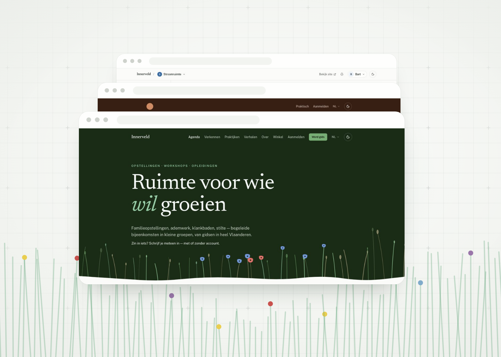
A series gets its own art direction because it complements the images: colours, typefaces and layout come from the series itself, not from a template. That is why the shared code has no art direction of its own, and no series has to look like another. Every series also opens several ways through it, and you are allowed to get lost in them. Whatever shows the way, though, always stays legible: getting lost is a design goal, getting stuck is not.
The real task is delivering images: large, at full resolution and still fast, on every screen. With every change, tests in a real browser make sure everything keeps working and stays accessible.
How the images are made
Every image starts with language. I work with a Lexicon of my own, six pillars to take an image apart and compose a new one: Flesh (body and gesture), Fiction (space and light), Garment (fabric against the body), Vibe (the emotional temperature), Lens (the mechanical eye) and Sound (what the image would let you hear). The words come from photography, fashion and film, never from empty superlatives.
Choosing is half the work: what goes into a series, what comes out, and in what order. For new series I worked out a production chain, tested on trial series: a concept and a shot list per series, images made in batches in the cloud, and a contact sheet to choose from. The trials taught me what holds a series together: one fixed anchor for the face, and exactly the same references for every image, or a character drifts.
How I build
I did not write the code of Flesh & Fiction by hand: it was built with agentic coding. I describe what has to be made and why, the AI builds, tests and documents, and I judge the result in the browser, on a phone and on a large screen. Much of what got better got better because I looked at it, not because a test turned red. A project that is itself about AI is good practice ground for that.
Agentic coding is a skill you build up, and there is more to it than asking a question: describing the work sharply, judging the result critically, and keeping the whole thing coherent. The AI market moves fast too, in images, video, sound and code at once, and keeping up is part of the job. That is how this one project touches a lot of technologies.
What it gives you feels like superpowers. Even though I can do a lot myself, I never get stuck any more: where I cannot go on, the agent helps me along. And a lot can run in parallel. That does not necessarily mean less work, but it does mean more work at once.
My work lies in what the technology does not decide: the images and what goes into a series, the concept of every series and the Lexicon, the art direction and the rules that protect it, and which design gets built, with which details. The designs came partly from AI too, as directions to choose from.
Image and sound in motion
The videos in this article are a first step towards moving images. They are compositions in HTML, built from the images, typefaces and colours of each series and from recordings of the live site, and each video tells the concept of its series. The sound is made in code too, without recordings: it starts from what a series’ Lexicon says about sound. Turn the sound on with the button on the video.
What comes next
Flesh & Fiction is a study, and what follows are plans. After the videos that show the series come images that move themselves, made with generative AI, and sound that belongs to a series, on the site itself as well. New series will come through the production chain, with recurring characters and the prompt kept next to the image, so that every series can show where it came from.
Whether it becomes a studio that works on commissions, a home for my own series, or both, is still open. The platform is built to grow with it, even when there are a hundred series.